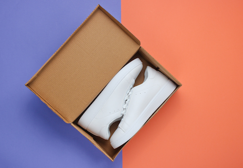
Product packaging is an evolving canvas. Year after year, new trends rise to the surface based on industry innovations and the ever-changing nature of consumer demands.
Whether you’re considering packaging options for a new product or thinking about revisiting packaging for existing products, it’s helpful to stay in tune with the latest trends. Here’s a look at some of the interesting shifts we’ve seen.
What’s Changing in the Packaging of Products?
A Greater Emphasis on Sustainable Solutions
Customers don’t just see sustainable packaging as a benefit to their purchase — they see it as a deciding factor in who they make their purchase from. Reports show that more than 52% of consumers are willing to pay more for products that use eco-friendly packaging, and 28% are even willing to pay up to 30% more.
A large part of this involves eliminating waste before the manufacturing process begins. Decide on what you need to include in the design, and identify opportunities to minimize material use and reduce the size of the packaging. These types of initiatives, in conjunction with other efforts, are helping brands like REI achieve their aspirations of being zero-waste-to-landfill in 2020.
Businesses Are Encouraged to Be Transparent
No consumer wants to have to guess what’s inside a product package. They’ve come to expect that the same solution that protects the product will clearly indicate what it is and what makes it unique to other products — no guesswork needed. Companies can set these expectations via visual authentication as well as messaging around the product’s features.
In some cases, this trend of transparent packaging takes on a more literal sense. Some designs deliberately exclude sections so consumers can see the product before it ever comes out of the package. With a better idea of what’s inside, customers are bound to feel more confident about their purchase.
The Idea that “Less Is More”
Just as clutter in your home can leave you feeling distracted and overwhelmed, the same can be said for packaging design. If the case that houses a product is too busy — whether that’s due to an overabundance of graphics or words — consumers can lose focus on what matters most. (This applies to the interior of the case as well. If there are a sea of wires and other components to sort through, with no rhythm to their placement, consumers can feel less than satisfied with their unboxing experience.)
That’s why many companies have turned to a more minimalist style of packaging. The benchmark, in this case, is Apple. While products are housed in simple, elegant white cases that showcase the company’s logo and product visuals/features, a minimalist vibe continues on the interior of the case, where the product is placed front and center and accessories are neatly displayed in sections underneath. From start to finish, the unboxing experience is intuitive.
Packaging That Tells a Story
Every company has a unique story to tell, and its packaging should be a reflection of that. Through the use of visuals, words, or a combination of these elements, packaging design should speak to the mission of a brand and connect with the emotions of consumers to drive action.
A good example of this comes from City Harvest, a non-profit organization in New York City. In an effort to encourage New York City residents to feed the hungry, the organization offered local grocery stores paper grocery bags that included a clear panel in the shape of a stomach — with donations going to feeding low-income families. The message was simple and powerful: When you fill the bag with groceries, once empty stomachs become full.
Have an idea for product packaging that you want to bring to life? As a designer and manufacturer of custom packaging and shipping cases, Cases By Source would love to hear from you. To get the conversation started, schedule your free consultation.


Leave a Comment